Visualizing spatial data#
Professional geospatial visualization and cartography is usually carried in dedicated software packages like Adobe Illustrator or ArcGIS. Most maps produced using programming tend to be simplistic and not particularly inspiring. But does this always have to be the case? There are a few specialists who have been able to produce visualling appealing maps and geovisualizations in Python. In this demo, we will see how far we can get with the cartopy package.
import cartopy.crs as ccrs
import matplotlib.pyplot as plt
import warnings
warnings.filterwarnings('ignore')
import numpy as np
World maps#
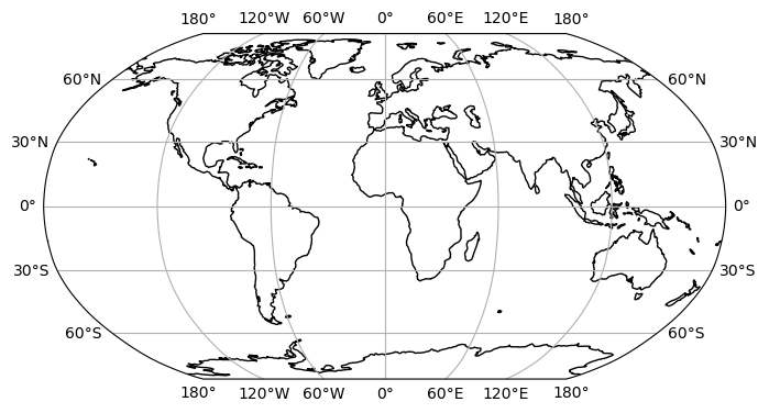
We can plot a world map with the Plate Carrée projection, adding a coastline, grid lines, and labels like so.
plt.figure(figsize = (8, 6))
ax = plt.axes(projection=ccrs.PlateCarree())
ax.coastlines()
ax.gridlines(draw_labels=True)
plt.show()

cartopy supports many other projections that can be found here. For example, a slightly better looking global projection is called Robinson.
plt.figure(figsize = (8, 6))
ax = plt.axes(projection=ccrs.Robinson())
ax.coastlines()
ax.gridlines(draw_labels=True)
plt.show()
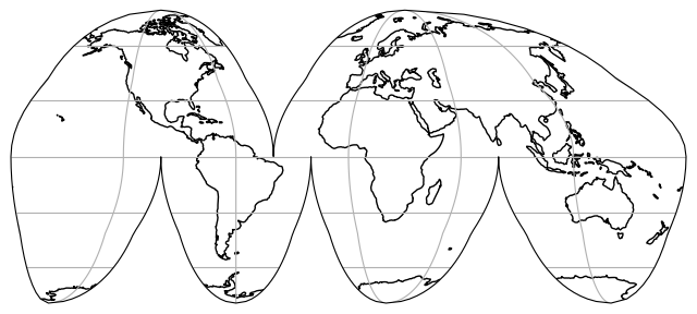
Then there are some more wacky one such as InterruptedGoodeHomolosine.
plt.figure(figsize = (8, 6))
ax = plt.axes(projection=ccrs.InterruptedGoodeHomolosine())
ax.coastlines()
ax.gridlines()
plt.show()
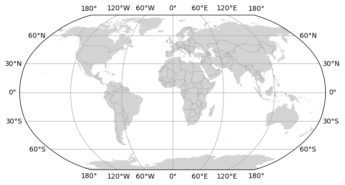
Adding features#
The cartopy.feature module provides easy access to common geographic vector features (e.g. ocean, land, borders, etc.) that we can add to the map as layers to bring attention to certain features.
import cartopy.feature as cfeature
plt.figure(figsize = (8, 6))
ax = plt.axes(projection=ccrs.Robinson())
ax.add_feature(cfeature.LAND, facecolor='lightgrey')
ax.add_feature(cfeature.BORDERS, edgecolor='grey', alpha=0.3)
ax.gridlines(draw_labels=True)
plt.show()
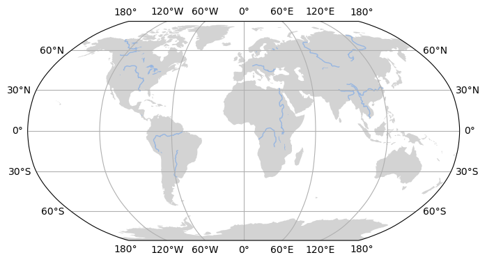
The cartopy.feature module also includes rivers and lakes.
plt.figure(figsize = (8, 6))
ax = plt.axes(projection=ccrs.Robinson())
ax.add_feature(cfeature.LAND, facecolor='lightgrey')
ax.add_feature(cfeature.RIVERS)
ax.add_feature(cfeature.LAKES)
ax.gridlines(draw_labels=True)
plt.show()
These base maps provide a template for global map figures that are found in many scientific articles.
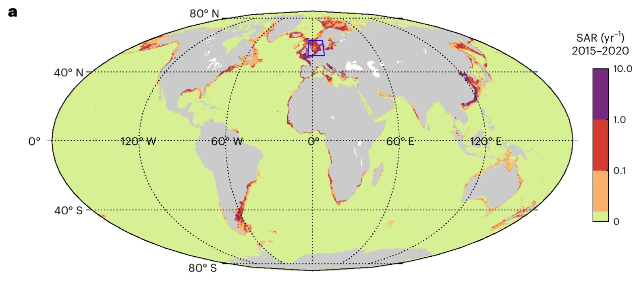
Zhang, W., Porz, L., Yilmaz, R. et al. Long-term carbon storage in shelf sea sediments reduced by intensive bottom trawling. Nat. Geosci. 17, 1268–1276 (2024). https://doi.org/10.1038/s41561-024-01581-4.
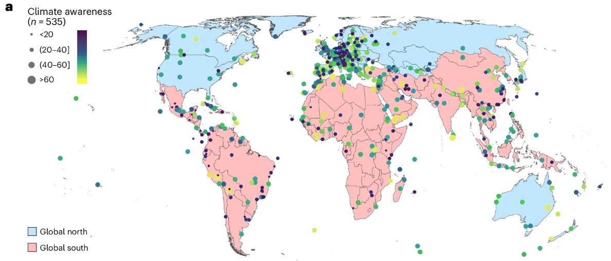
Chen, Y., Wang, D., Zhang, L. et al. World Heritage documents reveal persistent gaps between climate awareness and local action. Nat. Clim. Chang. (2025). https://doi.org/10.1038/s41558-025-02461-4.
Regional maps#
If we want to zoom in on a specific region of the world, we can use set_extent function which expects longitude and latitude coordinates ordered by: x0, x1, y0, y1.
plt.figure(figsize = (8, 6))
ax = plt.axes(projection=ccrs.PlateCarree())
ax.set_extent([-20, 60, -30, 35])
ax.add_feature(cfeature.LAKES)
ax.add_feature(cfeature.RIVERS)
ax.coastlines()
ax.gridlines(draw_labels=True)
plt.show()

Note
We can still use longitude and latitude coordinates to define the extent even if our map is projected using a different projection (e.g. SouthPolarStereo). We jus need to define the projection system of the coordinates (i.e. PlateCarree) when we pass set_extent.
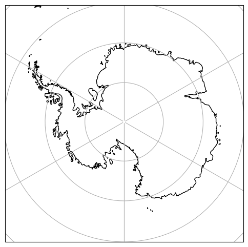
plt.figure(figsize = (8, 6))
ax = plt.axes(projection=ccrs.SouthPolarStereo())
ax.set_extent([-180, 180, -90, -60], ccrs.PlateCarree())
ax.coastlines()
ax.gridlines()
plt.show()
At some point, the resolution of the coastline starts to look a little coarse.
Note
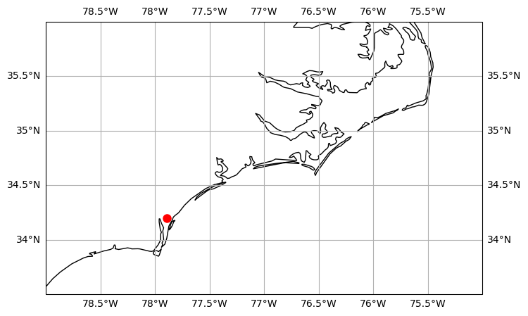
We can add points to the map using the plot function.
plt.figure(figsize = (8, 6))
ax = plt.axes(projection=ccrs.PlateCarree())
ax.set_extent([-79, -75, 33.5, 36])
ax.coastlines()
ax.gridlines(draw_labels=True)
ax.plot(-77.89, 34.20, 'o', color='red', markersize=8, transform=ccrs.PlateCarree())
plt.show()
Adding vector data#
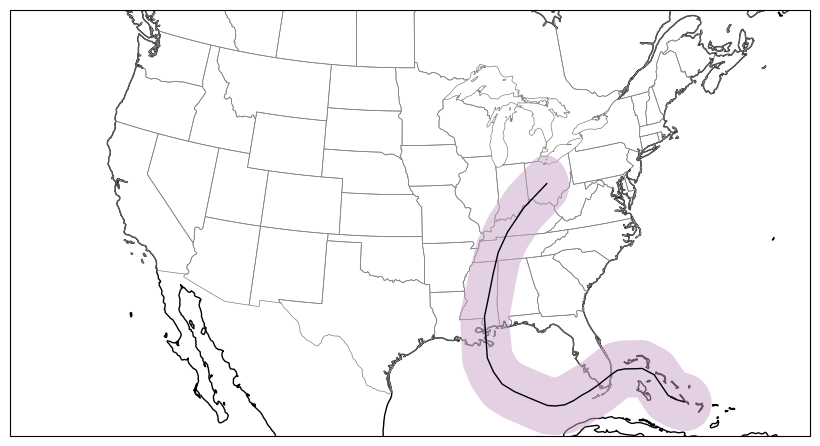
To add more complex vector data such as polylines and polygons to o0ur map we can use the add_geometries function. This function expects a shapely geometry as well as projection system. Here track is a polyline that represents Hurricane Katrina’s (2005) storm track and track_buffer is a polygon that represents a the storm track buffered by two degrees.
import shapely.geometry as sgeom
lons = [-75.1, -75.7, -76.2, -76.5, -76.9, -77.7, -78.4, -79.0,
-79.6, -80.1, -80.3, -81.3, -82.0, -82.6, -83.3, -84.0,
-84.7, -85.3, -85.9, -86.7, -87.7, -88.6, -89.2, -89.6,
-89.6, -89.6, -89.6, -89.6, -89.1, -88.6, -88.0, -87.0,
-85.3, -82.9]
lats = [23.1, 23.4, 23.8, 24.5, 25.4, 26.0, 26.1, 26.2, 26.2, 26.0,
25.9, 25.4, 25.1, 24.9, 24.6, 24.4, 24.4, 24.5, 24.8, 25.2,
25.7, 26.3, 27.2, 28.2, 29.3, 29.5, 30.2, 31.1, 32.6, 34.1,
35.6, 37.0, 38.6, 40.1]
# Convert lons and lats into a shapely LineString
track = sgeom.LineString(zip(lons, lats))
# Buffer the linestring by two degrees (note: this is a non-physical distance)
track_buffer = track.buffer(2)
fig = plt.figure(figsize = (8, 6))
ax = fig.add_axes([0, 0, 1, 1], projection=ccrs.LambertConformal())
ax.set_extent([-125, -66.5, 20, 50], ccrs.Geodetic())
ax.coastlines()
ax.add_feature(cfeature.STATES.with_scale('50m'), edgecolor='gray', linewidth=0.5)
ax.add_geometries([track_buffer], ccrs.PlateCarree(),
facecolor='#C8A2C8', alpha=0.5)
ax.add_geometries([track], ccrs.PlateCarree(),
facecolor='none', edgecolor='k')
plt.show()
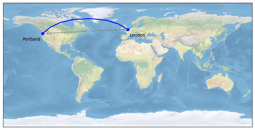
Note on Plate Carree vs. Geodetic#
Plate Carree is a projection system that flattens the Earth onto a 2D plane (in this case using cylindrical approach). The shortest distance between two points on a Plate Carree projection is therefore a straight line because latitude and longitude are treated as Cartesian coordinates.
Geodetic coordinate system is a spherical coordinate system that defines locations on a 3D sphere using angular units. The shortest path between two points therefore looks curved when projected onto a Plate Carree map and explains why flying from Portland to London provides an opportunity to see the Greenland Ice Sheet from above.
fig = plt.figure(figsize = (8, 6))
ax = fig.add_axes([0, 0, 1, 1], projection=ccrs.PlateCarree())
ax.stock_img()
portland_lon, portland_lat = -122.7, 45.5
london_lon, london_lat = -0.2, 51.5
plt.plot([portland_lon, london_lon], [portland_lat, london_lat],
color='blue', linewidth=2, marker='o',
transform=ccrs.Geodetic(),
)
plt.plot([portland_lon, london_lon], [portland_lat, london_lat],
color='gray', linestyle='--',
transform=ccrs.PlateCarree(),
)
plt.text(portland_lon - 3, portland_lat - 10, 'Portland',
horizontalalignment='right',
transform=ccrs.Geodetic())
plt.text(london_lon + 3, london_lat - 10, 'London',
horizontalalignment='left',
transform=ccrs.Geodetic())
plt.show()
Adding gridded data#
We can use the pcolormesh function from matplotlib to plot gridded data. This function represents data as a grid of colored blocks. Each block corresponds to a data point and is filled with a solid color determined by the colormap and the value of that data point.
# Sample data
nlats, nlons = (73, 145)
lats = np.linspace(-np.pi / 2, np.pi / 2, nlats)
lons = np.linspace(0, 2 * np.pi, nlons)
lons, lats = np.meshgrid(lons, lats)
wave = 0.75 * (np.sin(2 * lats) ** 8) * np.cos(4 * lons)
mean = 0.5 * np.cos(2 * lats) * ((np.sin(2 * lats)) ** 2 + 2)
lats = np.rad2deg(lats)
lons = np.rad2deg(lons)
data = wave + mean
lons = (lons + 180) % 360 - 180
fig = plt.figure(figsize = (8, 6))
ax = fig.add_axes([0, 0, 1, 1], projection=ccrs.Mollweide())
ax.pcolormesh(lons, lats, data, transform=ccrs.PlateCarree(),
cmap='coolwarm')
ax.coastlines()
plt.show()

Maps with gridded data are commonly used in scientific articles.
Qing, Y., Wang, S., AghaKouchak, A. et al. Delayed formation of Arctic snow cover in response to wildland fires in a warming climate. Nat. Clim. Chang. 15, 1091–1098 (2025). https://doi.org/10.1038/s41558-025-02443-6.
Meng, X., Yu, Y. & Ginoux, P. Rise in dust emissions from burned landscapes primarily driven by small fires. Nat. Geosci. 18, 586–592 (2025). https://doi.org/10.1038/s41561-025-01730-3.
Topographic maps#
Important
If we don’t need coastlines or political boundaries, then we don’t need to use cartopy.
Below is an attempt to make a really nice topographic map of Oregon using elevation data. We will use Global Multi-resolution Terrain Elevation Data (GMTED2010) which was produced by the USGS and the National Geospatial-Intelligence Agency (NGA). The data has a spatial resolution of 7.5 arc-seconds and can be downloaded from the Earth Explorer.
Read elevation data#
The first thing we do is open and read the data using rasterio. Remember that open methods produces a rasterio dataset object, which contains not only the elevation data but also information about the projection and extent of the image. The read method reads the data in the dataset object into a 2D numpy array.
import rasterio
import matplotlib.pyplot as plt
import numpy as np
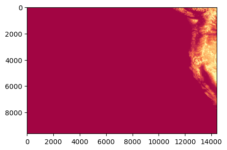
file = rasterio.open('data/30n150w_20101117_gmted_mea075.tif')
dataset = file.read()
print(dataset.shape)
(1, 9600, 14400)
# Plot data
fig, ax = plt.subplots(figsize=(5,5))
ax.imshow(dataset[0,:,:], cmap='Spectral')
plt.show()
Clip to study region#
There is a lot of ocean in this plot because geospatial data is often tiled and usually never quite aligns with our study area. Luckily, rasterio has a useful method to clip rasters based on a georeferenced shape, e.g. a polygon. In this case we can use an polygon of Oregon which can be downloaded from the Natural Earth database to clip the raster using the rasterio.mask.mask function.
import geopandas as gpd
from shapely.geometry import mapping
from rasterio import mask as msk
# Read Oregon shapefile
oregon_poly = gpd.read_file('data/oregon.shp')
# Clip raster
clipped_array, clipped_transform = msk.mask(file, [mapping(oregon_poly.iloc[0].geometry)], crop=True)
# Plot
plt.figure(figsize=(5,5))
plt.imshow(clipped_array[0], cmap='Spectral')
plt.show()
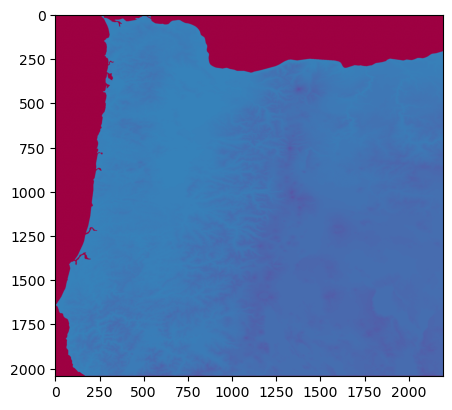
Now we have only elevation values that correspond to Oregon. However, by default rasterio.mask.mask will assign all values that are not within the Oregon polygon as zero. While this is sensible, these zeros will make the plotting tricky because they act as an anchor at the bottom of the colourmap. If there is a large gap between zero and the minimum elevation value in Oregon, then the map above will be produced, with real data in one half of the colourmap and the other half of the colourmap absent because there is a gap between zero and the minimum of the real data.
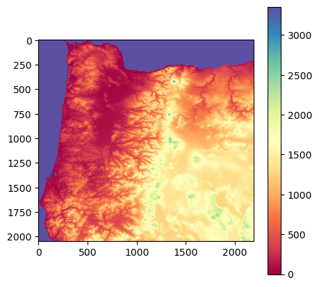
Re-assign nodata values#
Fortunately, the mask function allows us to explicitly set a specific value to grid cells that are not within the Oregon polygon with the nodata keyword argument. In the function below we pass the Oregon GeoDataFrame and the rasterio dataset object.
Notice that the mask function is called twice, first it is called as above and values not within the Oregon polygon are returned as zeros. On the second occasion, the nodata argument is used and the values not part of the Oregon polygon are set to be one greater than the maximum value in the Oregon topography dataset (as calculated with the first mask). The result is that we now have a dataset with no natural gaps. Also being returned by this function is the value_range variable. This corresponds to the range between the smallest and largest value in oregon_topography array and is useful for constructing colourmaps later.
def clip_raster(gdf, img):
clipped_array, clipped_transform = msk.mask(img, [mapping(gdf.iloc[0].geometry)], crop=True)
clipped_array, clipped_transform = msk.mask(img, [mapping(gdf.iloc[0].geometry)],
crop=True, nodata=(np.amax(clipped_array[0]) + 1))
clipped_array[0] = clipped_array[0] + abs(np.amin(clipped_array))
value_range = np.amax(clipped_array) + abs(np.amin(clipped_array))
return clipped_array, value_range
oregon_topography, value_range = clip_raster(oregon_poly, file)
plt.figure(figsize=(5,5))
c = plt.imshow(oregon_topography[0], cmap='Spectral')
plt.colorbar(c)
plt.show()
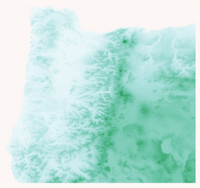
Construct a colormap#
Now we need to construct an appropriate colourmap. Here we make a five-class linear colormap using ColorBrewer as inspiration.
from matplotlib.colors import LinearSegmentedColormap
from matplotlib import colors
oregon_colormap = LinearSegmentedColormap.from_list('oregon', ['#edf8fb','#b2e2e2','#66c2a4','#2ca25f','#006d2c'],
N=value_range)
Note
All colors can be described using an RGB triplet or hexadecimal format (a hex triplet). In Python, hexadecimal color codes are defined with a leading number sign (#). More information can be found here
We still need to deal with the values that are not within Oregon. The solution is to construct a colormap with enough colours that each unique value within the Oregon elevation data has it’s own colour, then replace the last colour in the colormap with our background color.
from matplotlib.colors import ListedColormap
# Define an RGBA color
background_color = np.array([0.9882352941176471, 0.9647058823529412, 0.9607843137254902, 1.0])
newcolors = oregon_colormap(np.linspace(0, 1, value_range))
newcolors = np.vstack((newcolors, background_color))
oregon_colormap = ListedColormap(newcolors)
Note
This time we defined the background color using an RGB triplet + an alpha value which defines transparency.
oregon_colormap

# Plot
fig = plt.figure(facecolor='#FCF6F5FF', figsize=(5,5))
ax = plt.axes()
plt.imshow(oregon_topography[0], cmap=oregon_colormap)
ax.axis('off')
plt.show()
Adding a hillshade#
The final step is to add a hillshade to mimic light shining on the topography. A hillshade is a 3D representation of a surface and are generally rendered in greyscale. The darker and lighter colors represent the shadows and highlights that you would visually expect to see in a terrain model.
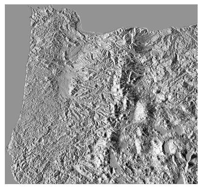
We will use EarthPy to generate our hillshade data. There are two parameters that can be tuned and they give very different results depending on the dataset. The first is the azimuth value which can range from 0-360 degrees and relates to where the light source is shining from. 0 degrees corresponds to a light source pointing due north. The second is the altitude of the light source and can range from 1-90. Below are some examples demonstrating how changing the azimuth value produces vastly different results.
Note
EarthPy can be installed by running pip install earthpy from the terminal or command prompt.
import earthpy.spatial as es
hillshade = es.hillshade(oregon_topography[0],
azimuth=0, altitude=1)
plt.imshow(hillshade, cmap='Greys')
plt.axis('off')
(np.float64(-0.5), np.float64(2191.5), np.float64(2043.5), np.float64(-0.5))
hillshade = es.hillshade(oregon_topography[0],
azimuth=90, altitude=1)
plt.imshow(hillshade, cmap='Greys')
plt.axis('off')
(np.float64(-0.5), np.float64(2191.5), np.float64(2043.5), np.float64(-0.5))
hillshade = es.hillshade(oregon_topography[0],
azimuth=180, altitude=1)
plt.imshow(hillshade, cmap='Greys')
plt.axis('off')
(np.float64(-0.5), np.float64(2191.5), np.float64(2043.5), np.float64(-0.5))
hillshade = es.hillshade(oregon_topography[0],
azimuth=270, altitude=1)
plt.imshow(hillshade, cmap='Greys')
plt.axis('off')
(np.float64(-0.5), np.float64(2191.5), np.float64(2043.5), np.float64(-0.5))
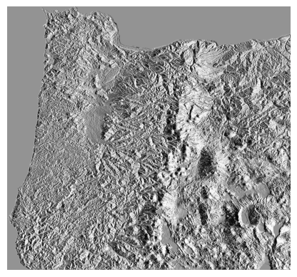
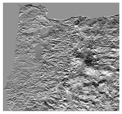
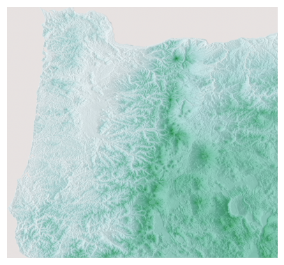
An azimuth value of 90 produces a nice shadow on the eastern side of the Cascades and Crater Lake. Definitely play around with these values though because there may be even better hillshades.
Plot map#
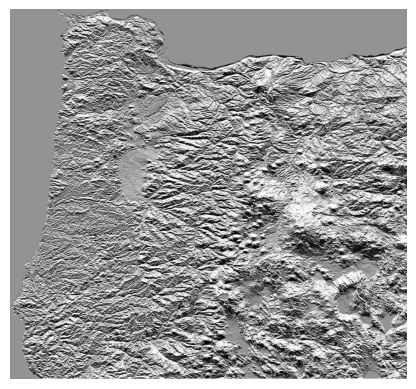
We can now plot the finished product. To do is we first plot the Oregon topography, then overlay the hillshade with a small alpha value that sets transparency.
fig, ax = plt.subplots(figsize=(5,5))
im = plt.imshow(oregon_topography[0],
cmap=oregon_colormap)
ax.imshow(hillshade, cmap='Greys', alpha=0.2)
ax.axis('off')
plt.show()
Add a colorbar and scalebar#
If we were producing a figure for a journal article, we may also want to add a colorbar and a scalebar. A colorbar is fairly simple in Matplotlib but the default option is a little clumsy. The code below allows us to make the colorbar match the size of the plot.
Adding a scalebar in is a little more annoying because Matplotlib doesn’t have any native functions to do this. But there is a package called matplotlib_scalebar that we can install which does the trick.
We just have to find the size of each pixel in meters. We can use this website to convert 7.5 arc-seconds to meters at a specific latitude.
Note
matplotlib_scalebar can be installed by running pip install matplotlib-scalebar from the terminal or command prompt.
from mpl_toolkits.axes_grid1 import make_axes_locatable
from matplotlib_scalebar.scalebar import ScaleBar
fig, ax = plt.subplots(figsize=(5,5))
im = plt.imshow(oregon_topography[0], cmap=oregon_colormap)
ax.imshow(hillshade, cmap='Greys', alpha=0.2)
ax.axis('off')
# Colorbar
divider = make_axes_locatable(ax)
cax = divider.append_axes('right', size='5%', pad=0.10)
fig.colorbar(im, cax=cax, orientation='vertical',
label='Elevation (m a.s.l.)')
#Scalebar
scalebar = ScaleBar(164,"m", length_fraction=0.2, pad=0.5,
border_pad=0.5, location=1)
ax.add_artist(scalebar)
plt.show()
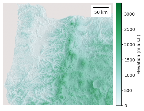
There we have it, a visually appealing topographic map of most of Orgeon ready to hang on a wall (or sell on Etsy…).
Census data#
In the final part of this lecture, we will use Python to produce another type of thematic map. But this instead of representing elevation data, we will visualize Census Bureau data.
We can automatically download Census Bureau data from the 2019 American Community Survey using census.
from census import Census
c = Census("cf7bfd71f6e64ddabdc65b3c7e00ebe11de9eea2")
Search for data#
Inspired by the article “Plumbing Poverty: Mapping Hot Spots of Racial and Geographic Inequality in U.S. Household Water Insecurity” by Shiloh Deitz and Katie Meehan (2019), we will search for data that determines whether household have adequate plumbing facilities.
The Census Bureau defines “complete plumbing facilities” as (1) piped hot and cold water, (2) a flush toilet, and (3) a bathtub or shower, all located within the housing unit and used only by occupants.
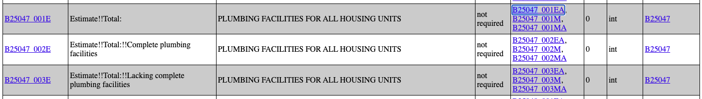
We can do a Ctrl + F to find the variables associated with plumbing facilities o: https://api.census.gov/data/2019/acs/acs5/variables.html
import pandas as pd
variable_list = ['B25047_001E', 'B25047_002E', 'B25047_003E']
data = c.acs5.state_county((variable_list), '37', Census.ALL)
df = pd.DataFrame(data)
df.head()
| B25047_001E | B25047_002E | B25047_003E | state | county | |
|---|---|---|---|---|---|
| 0 | 75456.0 | 74132.0 | 1324.0 | 37 | 001 |
| 1 | 16126.0 | 15333.0 | 793.0 | 37 | 003 |
| 2 | 7752.0 | 7596.0 | 156.0 | 37 | 005 |
| 3 | 9932.0 | 9466.0 | 466.0 | 37 | 007 |
| 4 | 17111.0 | 16863.0 | 248.0 | 37 | 009 |
Add spatial data#
We can add the geometries of the counties using a shapefile that represents the corresponding geographic units from here. We are interested in county level data we would navigate to the COUNTY/ folder and download the .zip file for North Carolina (i.e. tl_2021_us_county.zip)
counties = gpd.read_file('data/tl_2021_us_county/tl_2021_us_county.shp')
counties.head()
| STATEFP | COUNTYFP | COUNTYNS | GEOID | NAME | NAMELSAD | LSAD | CLASSFP | MTFCC | CSAFP | CBSAFP | METDIVFP | FUNCSTAT | ALAND | AWATER | INTPTLAT | INTPTLON | geometry | |
|---|---|---|---|---|---|---|---|---|---|---|---|---|---|---|---|---|---|---|
| 0 | 31 | 039 | 00835841 | 31039 | Cuming | Cuming County | 06 | H1 | G4020 | None | None | None | A | 1477645345 | 10690204 | +41.9158651 | -096.7885168 | POLYGON ((-96.55516 41.91587, -96.55515 41.914... |
| 1 | 53 | 069 | 01513275 | 53069 | Wahkiakum | Wahkiakum County | 06 | H1 | G4020 | None | None | None | A | 680976231 | 61568965 | +46.2946377 | -123.4244583 | POLYGON ((-123.49077 46.38358, -123.48813 46.3... |
| 2 | 35 | 011 | 00933054 | 35011 | De Baca | De Baca County | 06 | H1 | G4020 | None | None | None | A | 6016818946 | 29090018 | +34.3592729 | -104.3686961 | POLYGON ((-104.38368 34.69213, -104.37658 34.6... |
| 3 | 31 | 109 | 00835876 | 31109 | Lancaster | Lancaster County | 06 | H1 | G4020 | 339 | 30700 | None | A | 2169272970 | 22847034 | +40.7835474 | -096.6886584 | POLYGON ((-96.6814 41.04566, -96.68139 41.0456... |
| 4 | 31 | 129 | 00835886 | 31129 | Nuckolls | Nuckolls County | 06 | H1 | G4020 | None | None | None | A | 1489645185 | 1718484 | +40.1764918 | -098.0468422 | POLYGON ((-98.04802 40.35066, -98.04674 40.350... |
Merge#
plumbing = pd.merge(counties, df, left_on=['STATEFP', 'COUNTYFP'], right_on=['state', 'county'], how='inner')
plumbing.head()
| STATEFP | COUNTYFP | COUNTYNS | GEOID | NAME | NAMELSAD | LSAD | CLASSFP | MTFCC | CSAFP | ... | ALAND | AWATER | INTPTLAT | INTPTLON | geometry | B25047_001E | B25047_002E | B25047_003E | state | county | |
|---|---|---|---|---|---|---|---|---|---|---|---|---|---|---|---|---|---|---|---|---|---|
| 0 | 37 | 037 | 01008544 | 37037 | Chatham | Chatham County | 06 | H1 | G4020 | 450 | ... | 1765540362 | 70582736 | +35.7049939 | -079.2514542 | POLYGON ((-79.24113 35.57054, -79.24138 35.570... | 35013.0 | 34622.0 | 391.0 | 37 | 037 |
| 1 | 37 | 001 | 01008531 | 37001 | Alamance | Alamance County | 06 | H1 | G4020 | 268 | ... | 1096736059 | 27940532 | +36.0439535 | -079.4005733 | POLYGON ((-79.43277 35.84368, -79.43396 35.843... | 75456.0 | 74132.0 | 1324.0 | 37 | 001 |
| 2 | 37 | 057 | 01008548 | 37057 | Davidson | Davidson County | 06 | H1 | G4020 | 268 | ... | 1432728609 | 37604804 | +35.7951312 | -080.2071070 | POLYGON ((-80.06476 35.56138, -80.06477 35.560... | 75615.0 | 73418.0 | 2197.0 | 37 | 057 |
| 3 | 37 | 069 | 01008553 | 37069 | Franklin | Franklin County | 06 | H1 | G4020 | 450 | ... | 1273761673 | 7173998 | +36.0882406 | -078.2830903 | POLYGON ((-78.11729 36.03752, -78.11743 36.037... | 30790.0 | 29761.0 | 1029.0 | 37 | 069 |
| 4 | 37 | 155 | 01026130 | 37155 | Robeson | Robeson County | 06 | H1 | G4020 | 246 | ... | 2453481924 | 5076395 | +34.6392096 | -079.1008811 | POLYGON ((-79.12835 34.88294, -79.12795 34.883... | 48874.0 | 46781.0 | 2093.0 | 37 | 155 |
5 rows × 23 columns
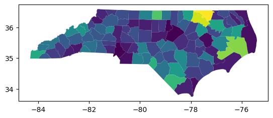
# Compute proportion of household with inadequate plumbing
plumbing['lack_plumbing_percent'] = plumbing['B25047_003E'] / plumbing['B25047_001E']
Simple choropleth map#
GeoPandas provides a high-level interface to the Matplotlib library for making maps. It is as easy as using the plot() method on a GeoDataFrame.
plumbing.plot('lack_plumbing_percent')
<Axes: >
Improving the choropleth map#
This is useful for a quick look over the data but we would prefer to customize our plot. For instance, we should add a title, colorbar, and nicer colormap.
fig, ax = plt.subplots(figsize=(8,5))
plt.title('Lack of plumbing in the western United States', fontsize=10)
ax.set_axis_off()
divider = make_axes_locatable(ax)
cax = divider.append_axes("right", size="3%", pad=0.5,alpha=0.5)
plumbing.plot('lack_plumbing_percent', ax=ax, alpha=0.5, cmap='Greens',
edgecolor='k', legend=True, cax=cax, linewidth=0.1)
plt.ylabel('Proportion of households', fontsize=10)
plt.show()

Interactive plots#
Alongside static plots, GeoPandas can produce interactive maps based on the Folium library, which is itself based on Leaflet.
m = plumbing.explore(
column="lack_plumbing_percent", # make choropleth based on column
scheme="naturalbreaks", # use mapclassify's natural breaks scheme
tooltip="lack_plumbing_percent",# show column value in tooltip (on hover)
popup=True, # show all values in popup (on click)
tiles="CartoDB positron", # use "CartoDB positron" tiles
cmap="Greens", # use "Greens" matplotlib colormap
style_kwds=dict(color="black", weight=0.5) # use black outline with weight of 1
)
m
Conclusions#
Maps made using programming don’t have to be terrible - it is possible to produce visually appealing maps in Python. They may never be quite as good as what professional cartographers can produce in Adobe Illustrator but they have other advantages. Once the code is written, we can quickly make edits or add another dataset. I hope this demo has inspired you to improve the quality of your Python plots!